
Disclaimer: NFX is an investor in Rahul Vohra’s angel fund.
While most companies are focused on building a beautiful machine — a 100% tech-driven, algorithmic, human-free experience — by contrast and even by name Superhuman is oriented in the opposite direction. The email company is known for its personable, high-touch onboarding, requiring significant human interaction. When others talk about automation and breakneck scale, Superhuman talks about spending time with customers and launching small.
It’s a counterintuitive approach to building product. My experience at Trulia was similar. While our initial vision was full automation, when we combined great software with human touch, our conversions skyrocketed.
I wrote in a recent piece on 28 Moves to Survive and Thrive in a Downturn that the only way to break through in a crisis — or to beat the competition under normal circumstances — is to 10x your product by offering a dramatically better product experience. 10x product outcomes are a result of how you as a Founder think, and it’s almost always counterintuitive to the conventional approach. It’s a matter of conviction.
Rahul Vohra is one of the rare Founders and product builders with this conviction. He is the Founder and CEO of Superhuman, where he and his team are building the fastest email experience in the world. Rahul was previously the Founder of Rapportive, acquired by LinkedIn in 2014.
I recently spoke with Rahul for a special NFX “keynote” podcast. His strategic thinking on product-market fit is verging on legendary.
In this NFX podcast episode and essay, Rahul shares the frameworks he wants every Founder to know about:
- Customer Onboarding
- Product Development
- Positioning
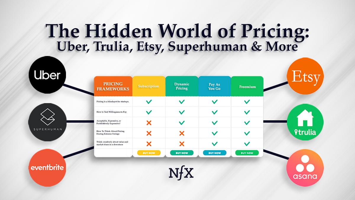
- Pricing
1. Don’t Launch. Onboard.
With any email client, task manager, or calendar app, you have an especially massive surface area for bugs, because you have wide variability in how users want to use the product.
If you run a traditional Launch and sign up tens of thousands of users quickly, they will find thousands of bugs and quickly overwhelm your team. You won’t be able to fix the issues fast enough. Your users will then be disappointed and churn out of the product — and tell everyone about their poor experience.
Instead, do a measured, rolling, Founder-led launch in 4 distinct phases that involves onboarding your earliest users:
- Phase One: Testing Readiness — The product Founder (ideally this is the CEO) should do the onboardings to test whether the company is even ready to do onboardings. The Founder should be able to do them best because she or he holds the most integrated and comprehensive view of the product. You should be doing at least five to six onboardings a week. You know you are ready for phase two when you have great metrics (retention, user engagement).
- Phase Two: Testing Limited Scalability — Another senior member of the team, who is not a Founder, should take the lead. The primary goal of this phase is to show that somebody other than the Founder can do onboardings and still produce great metrics. (In our case, it was the Head of Growth.) The secondary goal is to move onboarding toward something that can scale. We reduced onboarding time from two hours down to one hour, and ramped to 20 onboardings per week, still keeping great metrics.
- Phase Three: Testing Wide Scalability — Build a full-stack growth team. Everyone on the growth team does demand generation, lead qualification, customer support, and onboarding. The primary goal of this phase is to show that somebody other than a senior member of the team can do onboardings and still produce great metrics. Secondary goals are to further evolve the onboarding experience towards something that can scale, and create training plans for the next phase of growth. Expect the growth generalists to be doing 20 onboardings per person per week alongside other responsibilities. This phase usually lasts a few months. We reduced the onboarding time from one hour to 45 mins without a degradation in metrics.
- Phase Four: Scaling Revenue — Build a team of onboarding specialists that should be able to do onboardings better than anyone in previous phases. The primary goal of this phase is to scale revenue while maintaining everything that makes the experience delightful and magical. During this phase, we got onboardings from 45 minutes to 30 minutes.
- On Training: It’s super important to run a comprehensive training program for each new onboarding specialist. They are now the front line of the company. Our training program runs for 8 weeks. Once fully ramped, each onboarding specialist is able to do 35 to 45 onboardings per week.
- On Finding Onboarding Talent: Founders often ask me the ideal background of an onboarding specialist. Sales backgrounds can work well but we’ve found that other backgrounds — teaching and hospitality to name two — also work very well.
Caveat: By all means, do a traditional launch if you need one of the three Cs quickly: capital, candidates, or customers.
Superhuman’s Six-Step Onboarding Approach
I myself did the first 200 new user onboardings in Phase One. I wasn’t concerned with how long each onboarding took; many took two hours. Each onboarding had six parts.
- Give the new user a detailed demo of Superhuman, and share what makes it magical and delightful.
- Reminder that Superhuman is a paid, premium product and test price sensitivity with the Van Westendorp Test.
- Ask how they currently do their email and take notes on all the Superhuman features they would benefit from.
- Show them how to get through email in Superhuman twice as fast as they were doing before.
- Insist that they do email with you, live, for 30 minutes. Doing it with them is crucial because every time, I would find 5 to 10 bugs that I would send back to my team. We would make sure to fix them within a week. If we didn’t, we wouldn’t be able to surface the next set of bugs that we should address.
- Send them a personalized gift (I would send a bottle of wine or whiskey) to show them how much you valued their time. This obviously slows down as you get out to scale with many thousands of users.
2. To 10x Your Product, Study Game Design.
We have a product philosophy of using game design to make our software more fun to use and help our users move faster.
Here’s how it works. We start with a philosophy that is different from most of Silicon Valley. Rather than focus on features that users need, we focus on how software makes a user feel.
Business (and most productivity) software feels like work. We design our products to work and feel like games; this is the core of why people fall in love with it. Nobody needs a game to exist. There are no requirements. For that reason, when you make a game, you don’t worry about what users want or need. Instead, you obsess over how they feel.
When your product is more like a game than work, people don’t just use it. They “play” it, they find it fun. They tell their friends, they fall in love with it. Game design turns out to be an altogether different kind of product development.
I learned to code to make games and worked as a game developer. It turns out there is no unifying principle of game design. We are building those principles, drawing upon the art and science of psychology, mathematics, storytelling, and interaction design.
We’ve identified 5 key factors to consider:
- Goals
- Emotions
- Toys
- Control
- Flow
Across these, we further identified many principles of game design as we built Superhuman.
For example, “Are toys the same as games?” We play with toys, but we play games. A ball is a toy, but football is a game. And as it turns out, the best games are built with toys. Because then they are fun on multiple levels, the level of the toy and also of the game itself.
As a single example, consider our autocompleter which you use to snooze emails:
a) You type whatever you want. It does its best to understand you. For example, “two d” becomes two days and “three h” becomes three hours. It is fun because it’s a playful exploration. Users find this feature — this toy — and start to ask,“What can it do? When does it break? How does it work?” This becomes a game for them.
b) They might ask “I wonder what happens if I keep typing 10?” It turns out that is October the 10th at 10:00 PM. Or how about a sequence of twos? That’s February the second, 2022 at 2:00 PM. And then we see people start trying more complex inputs like in a fortnight and a day.
c) Users keep finding pleasant surprises. For example, time zone math happens without you ever thinking about it. You can type in 8:00 AM in Tokyo that turns out to be 8:00 PM Eastern time. We weave the surprise through the product.
d) Sometimes the surprises have no real purpose. For example, you can snooze emails until never; you can literally type in the word “never.” Then that email will never come back. If you are thinking about this from a “feature’ mindset, why would you have that option? It’s the same as deleting an email. But from a game mindset, it’s fun and playful so it makes users happy and keeps them engaged.
Consider all the features of your own product and ask yourself these questions:
- Do they indulge playful exploration?
- Are they fun? Even without a goal.
- Do they create moments of pleasant surprise?
If so, you have a toy and you’re on the way to building a great game… even if it is productivity software.
3. To Nail Your Pricing, Start With Positioning.
We first started by thinking about positioning. We were heavily influenced by Madhavan Ramanujam and his book Monetizing Innovation. For those who don’t know Madhavan, he’s a partner at Simon-Kucher & Partners, the preeminent pricing firm in the valley. The thing that I got from that book was before you figure out pricing, you must first figure out your positioning.
Then we talked to Arielle Jackson who was the first Product Marketing Manager on Gmail at Google. She advises using a simple but effective 6-part formula to determine positioning:
- For (target customer)
- Who (statement of need or opportunity)
- (Product name) is a (product category)
- That (statement of key benefit)
- Unlike (competing alternative)
- (Product name) (statement of primary differentiation)
Then we started to ask ourselves questions. Are we the Ford of email? No, not really. Are we the Mercedes of email or the BMW? Maybe, but not quite. Are we the Tesla of email? We’re getting there, but it’s not quite right.
In 2015, we came up with the following positioning for Founders, CEOs, and managers of high growth technology companies who feel like their work is mostly email.
“Superhuman is the fastest email experience ever made. It’s what Gmail could be if it were made today instead of 12 years ago. And unlike Gmail, Superhuman is meticulously crafted. So that everything happens in a hundred milliseconds or less.”
The positioning makes it clear Superhuman is a premium product. From that, we moved on to pricing.
We asked 4 questions:
- At what price would you consider Superhuman to be so expensive that you would not consider buying it?
- At what price would you consider Superhuman to be priced so low that you would feel the quality could not be very good.
- At what price would you consider Superhuman to be starting to get expensive? (So that is not out of the question, but you would have to give some thoughts to buying it. This is the question we paid most attention to.)
- At what price would you consider Superhuman to be a bargain and a great buy for the money?
Since we were building a premium product we paid most attention to the third question. The median answer to this question actually turned out to be $29 per month. A few conversations with some pricing experts later, we rounded up to $30 per month.
Rounded prices signal quality; prices that end in a 9 signal a bargain.
That’s how we picked our price.
Founder Resources mentioned in this podcast:
- Tool – Van Westendorp Price Sensitivity Meter
- Book – Monetizing Innovation, by Madhavan Ramanujam
- Book – Positioning: The Battle for Your Mind, by Al Ries & Jack Trout
- Book – The Art of Game Design, by Jesse Schell
To learn more about Superhuman, visit www.superhuman.com. Subscribe to the NFX podcast for more insights from top Founders on how they built iconic companies.
As Founders ourselves, we respect your time. That’s why we built BriefLink, a new software tool that minimizes the upfront time of getting the VC meeting. Simply tell us about your company in 9 easy questions, and you’ll hear from us if it’s a fit.
